09 March 2012

Highlights from the ADAA

More from Armory Week.  Here are some highlights from the excellent ADAA Art Show.  There was lots to like but especially the many single artist shows in a lot of the booths this year.  I love this fair because its easily digestible and you feel like you can see a lot in an hour or two with our your eyes being exhausted and your head spinning from too many boothss.  My photography is again lacking but hopefully this will inspire you to head to the Park Avenue Armory to take a look for yourself.

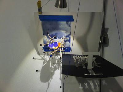
I love Sarah Sze's work in Tanya Bonakdar's booth.  I have been following her career since she was first represented by Marianne Boesky years ago and she just finished up a fabulous exhibition at the Asian Society.  She creates these small worlds from detritus, household objects, string, wire, lights, water bottles, socks....its always a surprise to see what's in there.   The work seems delicate, but also expanding and invading your own space.  The work seems temporary, but also timeless at the same time.  She makes the 2-dimensional into 3-dimensional by using paint drips as a sculptural devices as well as the introduction of paper and 2-d images into her little worlds.  The important way to experience her work is to move around it and see it from as many perspectives as possible.  It will fool with your spatial perspective, wow you with how mundane items seem to be elevated to elegant, pristine art and the theatricality of it all keeps you fascinated.   It must be seen in person to really appreciate it.


Another great booth is Chris D'amelio's exhibition of Daniel Hesidence's paintings.  These are small jarring, violent expressionistic portraits of women painted on board in gorgeous tones of maroons, burgundies and reds.  The women have blood on their faces and their eyes are gouged and scratched through to the surface of the paint.  Its not easy to look at but there is a beauty in the textures, and the installation is wonderful.  This is a marked departure from the artist's previous abstractions and the first exhibition by the gallery under its new name D'amelio Gallery from D'amelio Terras.


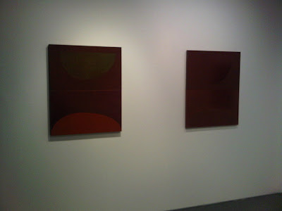
Another great installation is Susan Frecon's smaller abstractions in the David Zwirner booth.  The colors and forms are deep and soothing with a heavy modernist touch.  Make sure that you ask to see her small works on paper hidden in the closet.  Those are the real gems - these deep tones on delicate paper.  They are wonderful!!


I have been a fan of Ori Gersht's work for a while - simply in the fact that its lovely and fun to look at.  In CRG's booth, they have dedicated the space to his very large photographs which I believe are film stills from him exploding enormous bouquets of flowers.  He does this by using fireworks and then lowering the temperature to a point where they will start to smolder and then explode.  You could look at this as a contemporary take on the French and Dutch floral still lifes of the 17th century but I don't think that they really go much deeper than that.  The real stars of the show are the much smaller works that are in the booth.  The smoke is just starting to swirl around the flowers just anticipating the moment of explosion and another is a close of up the explosion - these are really special and more spectacular than the massive photos.


Before I get to my favorite artist shown at the ADAA, the only non-single artist show that I really enjoyed are the Joseph Cornell and Ray Johnson collages at Richard Feigen's booth.  I am insane for Joseph Cornell boxes and collage in all there nostalgic, surreal glory and their references to nature and death - last year L&M had an amazing solo show of Cornell works at the ADAA show and it nearly brought me to tears.  I love these two crazy collages by him (the two first images) that are juxtaposed with collages by Ray Johnson.  It's an interesting dialogue between these two artists and worth checking out.


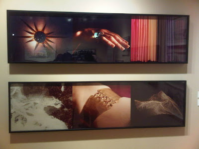
The highlight of the ADAA Art show was Margo Leavin's booth and her exhibition of the works by William Leavitt.  I don't think he is as well known on the East Coast as he is on the West, but he is an artist who came of age with the other Californian Conceptualists, namely John Baldessari et al.  He just had a retrospective at the MOCA in LA last year and he has been working in many different mediums - drawing, photography, painting, performance over the years.  His drawings have both a formalist quality as well as surrealist elements.  There is a lot attention and influence of architecture with modernist geodesic domes in the background as well idea of the curtain - something hiding and that could possibly revealed.  I find a big influence of deChirico in his Leavitt's early palette and spatial arrangement.  Like the Conceptualists, there is no narrative or a lot of ambiguity to the objects that are juxtaposed to one another and sometimes the space and arrangements do not make sense - which is the strength of the work as your brain tries figure everything out.  I was blown away by the timelessness of it all, and even given the very modernist influences, how up to the minute the work looked to me.  He is definitely an artist's artist and you can see how a lot of young West Coast artists have been heavily influenced by him.  My favorite works are the last ones - the photographs that are lovely in tone and keep your head spinning with questions about what it all means.  The formal qualities of the work are superb - the different textures, the cropping, the lighting, the noirish quality of the works - here he make Conceptualism sexy.  His work really blew me away.


Enjoy!!!

08 March 2012

These are a few of my favorite things...(at the Armory)

Try to catch these great works of art at the Armory Show (all in Pier 94) in New York City this weekend!!  (I apologize in advance for my kooky photography.)

First off, there is a whole section devoted to Nordic galleries and artists this year.  I could watch this  kinetic work by Tommi Gronlund and Petteri Nisunen in the Galerie Arhava booth for an hour.  Thousands of minute ball bearings are on a metal platform with sides high enough for the balls not to escape.  The platform moves ever so slowly making a wave of balls from one end to another creating random forms and a waterfall sound.  Its fun to watch and totally hypnotic.


I am insane for this beautiful Diana Al-Hadid work on paper at the Marianne Boesky booth.  Known for her elaborate and enormous sculpture, she has also be working on these drawings simultaneously as well.  Her works on paper first started out more architecturally based but her newer drawings are more abstracted with a introduction of color (blue watercolor here).  The texture in materials really need to be experienced in person.  This is quite large compared to her previous works.  I am eagerly anticipating her first solo exhibition with this gallery in the fall.


Also in the Marianne Boesky booth, there are these new works by Barnaby Furnas.  Here is an example.  He is taking his Flood Series to a new level, with a single canvas now sectioned vertically with separate intervals of the same scene, a repetition of the same scene or more cubistic view of the flood (of blood).  Either way, they are intriguing.  I am looking forward to his next show at this gallery in the fall as well.


I am crazy about the Cuban art duo, Los Carpentieros, at the Sean Kelly Booth.  These works are based on Lego renderings of Eastern European Monuments.  Much of the time they turn their watercolor studies, like you see here, into sculptures in the future.  I really hope that we get to see these in 3-dimensional form.  What I love about their works is their high technical skill with watercolor, the non-overt subversive nature of their work and their commitment to humor in all they do.


These Richard Dupont sculptures at the Gallery Michael Janssen booth are very interesting.  Like his previous works, the artist bases his sculpture on his own body.  Here are massive heads made from a transparent  composite that contain personal and studio detritus.  Are these the thoughts of the subject?  Are our thoughts too crowded with images on a daily basis?  Are these memories that we can't escape? Whatever it means, they really capture you.


This is the most striking work at Peter Blum.  Daniel Rich's acrylic painting of a close up view of the Milad Tower in Tehran in all its intricate detail in a straight-edged style is fantastic.  The work requires you to look up close and the colors are superb.


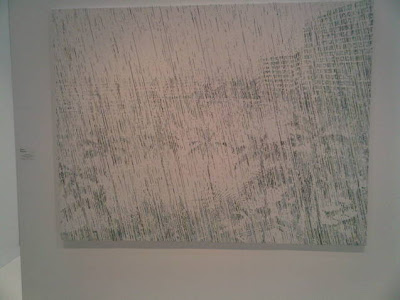
It was exciting to see the new direction that Kevin Zucker is taking in his work at the Eleven Rivington booth.  There are two landscape "paintings" - large and computer generated.  The texture and colors of the surface are fun to look at and are somewhat pointilistic in their rendering.  The marks up close turn into palm trees as you move away from the canvas.  I like their muted tones and although it seems that many are finding it difficult to be excited about computer generated painting these days and are looking forward to more traditional technique, I find his works to continue to be intriguing.


A great thing about this Armory is there seems to be a few more single artist exhibitions - which is a great way to get to know a new artist or see an artist's work more in depth.

I found these faceless paintings by Gideon Rubin in the Rokeby booth very arresting.  I love the nostalgic, muted palette and scenes.  They are quiet, unnerving and I love the play in scale among all the works.


Not to miss is the  Horton Gallery booth showing Wallace Whitney's gorgeous colorful abstractions.  The colors are vibrant and vivid and evoke a lot of feeling.  Beautiful.


In the same vein, do not miss the CRG booth highlighting new works by Tomory Dodge.  Small, jewel-like, colorful abstractions next to more modern landscapes.  I love the colors and textures of these paintings.  And, you can definitely fit these in a NYC apartment!!


Greenberg Van Doren is showing two artists, one which is one of my favorite contemporary landscape painters, Cameron Martin.  (See a previous blog with his last exhibition with this gallery.)  Continuing the same idea of his last exhibition, these are very muted, almost monochromatic, paintings of mountains, close-ups of birch trees and rock formations that you can barely distinguish from far away.  They look like faded old photographs.  However, here, in these new paintings, he has added some black horizontal and vertical lines and geometric rectangles and squares.  These bring these landscapes to the present by referencing minimalism as well as digital imagery.  I think these are my favorite works in the whole fair!!!!


Enjoy!!